Project details
Client:
Fluvius, De Waterunie
Tool:
Figma, Hotjar
UI Glow-Up: Sharper, Smarter, Cleaner Interfaces
Unifying the Look, Amplifying the Experience
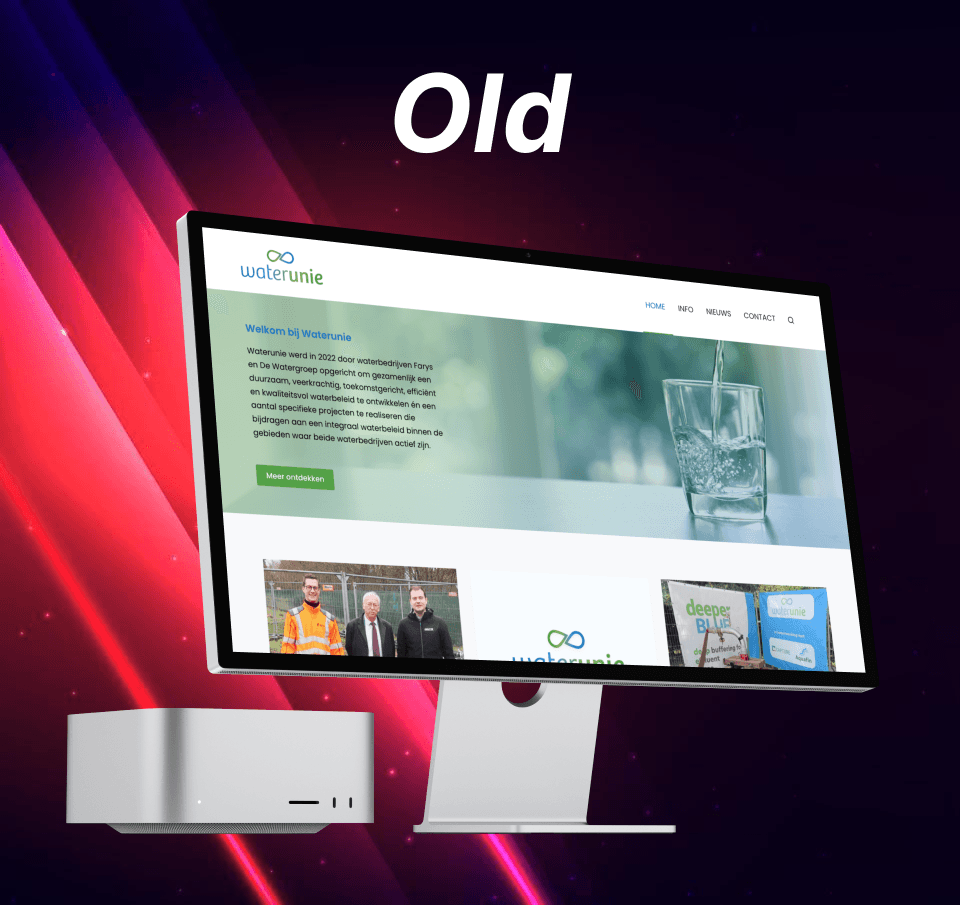
Across multiple customer-facing tools, I led and proposed UI redesigns aimed at creating a lighter, more cohesive visual language—one that not only modernizes the interface but actively supports business goals through better usability and clearer analytics.
Each redesign was grounded in real user behavior: I used customer journeys to uncover friction points and identify where visual inconsistencies or cognitive overload were slowing users down. From there, I introduced a refined UI style that stripped away unnecessary complexity, aligned components across views, and allowed key actions and data to stand out.
While some of these redesigns were implemented, others were strategic proposals—ready for rollout when budget and capacity were available. The common thread? Design decisions driven by insight, not aesthetics alone. Whether shipped or in progress, each suggestion aimed to elevate the user experience while giving internal teams better visibility into performance through smarter layout and hierarchy
My Approach to UI Redesigns
When working on new or improved UI designs, I focus on creating interfaces that are not only visually cohesive but also highly usable and scalable. Here’s what I consistently evaluate and optimize:
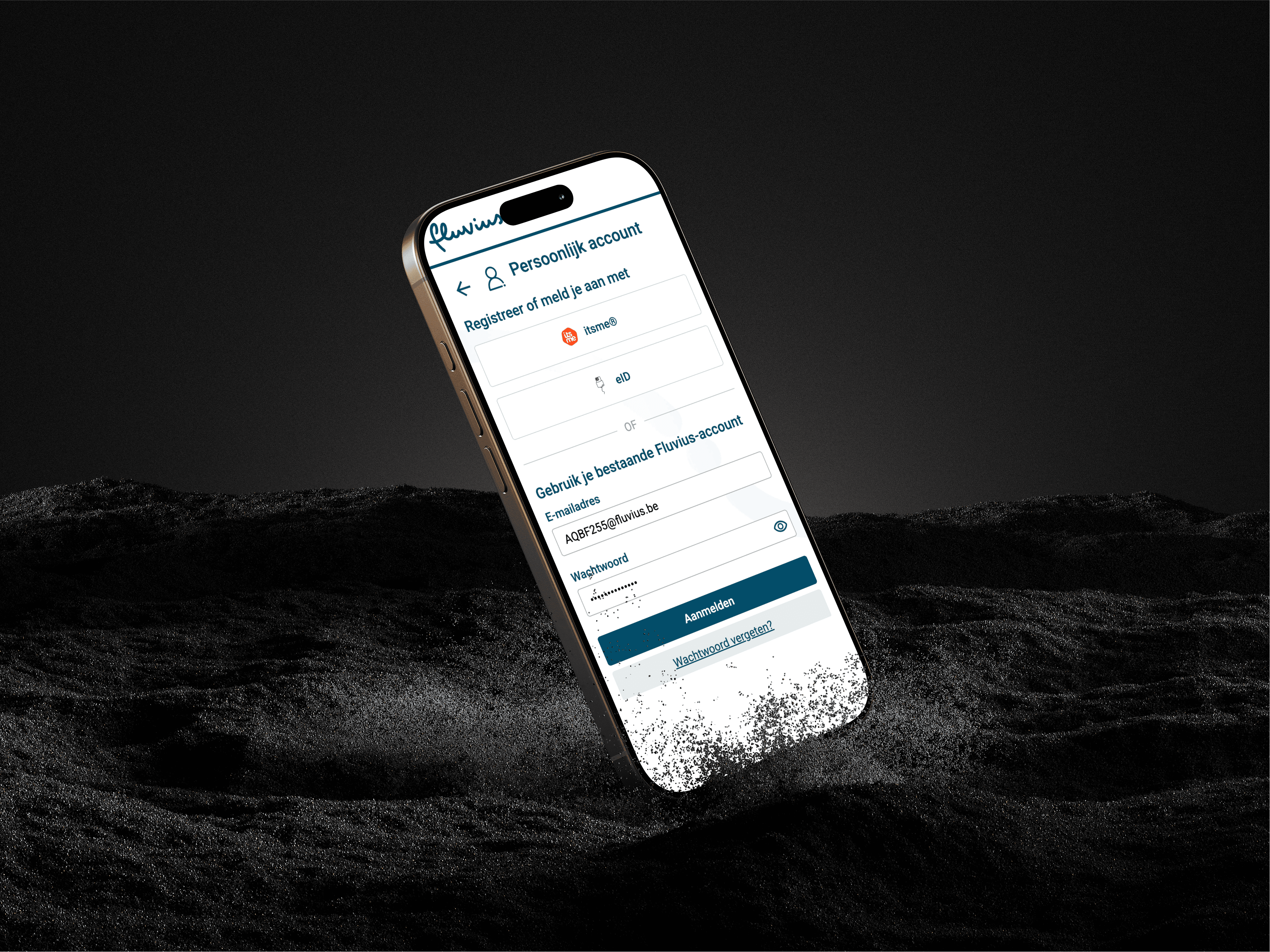
✅ Accessibility (WCAG-compliant)
I apply the latest WCAG 2.1 guidelines to ensure the UI is accessible to as many users as possible, including sufficient contrast, readable type sizes, and clear focus states.
📊 Data-Driven Insights
I use tools like Hotjar and Useberry to analyze real user behavior—such as clicks, scroll patterns, and drop-offs—to guide design decisions based on what users actually do, not just what they say.
📱 Mobile Optimization
All designs are created with a mobile-first mindset or tested across breakpoints to ensure functionality and usability on every device.
🎯 Flat, Minimalist Aesthetic
I apply a flat and minimalistic style when it fits the client’s brand—prioritizing clarity, whitespace, and modern visual language to support the content rather than compete with it.
📐 Responsive Design
Every layout is built responsively, ensuring consistency and usability across all screen sizes—whether desktop, tablet, or mobile.
🔠 Clear Visual Hierarchy
I structure content using strong typographic and layout principles, making it easy for users to scan, understand, and act.
🧩 Design Consistency
I maintain consistent component usage, spacing, and styling across the UI—either by working within an existing design system or establishing one when needed.
🔁 Iterative Improvements
I continuously test and improve the designs based on user feedback, analytics, and internal input, ensuring each version gets closer to the ideal user experience
My Approach to UI Redesigns
When working on new or improved UI designs, I focus on creating interfaces that are not only visually cohesive but also highly usable and scalable. Here’s what I consistently evaluate and optimize:
✅ Accessibility (WCAG-compliant)
I apply the latest WCAG 2.1 guidelines to ensure the UI is accessible to as many users as possible, including sufficient contrast, readable type sizes, and clear focus states.
📊 Data-Driven Insights
I use tools like Hotjar and Useberry to analyze real user behavior—such as clicks, scroll patterns, and drop-offs—to guide design decisions based on what users actually do, not just what they say.
📱 Mobile Optimization
All designs are created with a mobile-first mindset or tested across breakpoints to ensure functionality and usability on every device.
🎯 Flat, Minimalist Aesthetic
I apply a flat and minimalistic style when it fits the client’s brand—prioritizing clarity, whitespace, and modern visual language to support the content rather than compete with it.
📐 Responsive Design
Every layout is built responsively, ensuring consistency and usability across all screen sizes—whether desktop, tablet, or mobile.
🔠 Clear Visual Hierarchy
I structure content using strong typographic and layout principles, making it easy for users to scan, understand, and act.
🧩 Design Consistency
I maintain consistent component usage, spacing, and styling across the UI—either by working within an existing design system or establishing one when needed.
🔁 Iterative Improvements
I continuously test and improve the designs based on user feedback, analytics, and internal input, ensuring each version gets closer to the ideal user experience
Designing with Data: UI Redesigns Backed by Real User Behavior
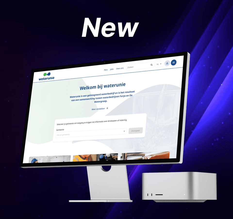
UI redesign isn’t just about aesthetics—it’s about relevance and performance. By analyzing behavior through Hotjar and website analytics, we discovered a key issue:
Some of the largest UI elements on the landing page were receiving less than 1% of total clicks. Despite their visual weight, users were ignoring them—because they didn’t match what people were actually looking for.
Instead, analytics showed that visitors were primarily searching for quick access to the customer portal, contact options, and service-related info—none of which were given priority in the previous layout.
We used this data to:
Refocus call-to-actions (CTAs) on high-demand areas like the customer portal and contact options
Visually de-emphasize low-performing elements, replacing them with more relevant content
Collaborate with the marketing and web teams to align UI changes with updated SEO and content strategy
Iterate based on real search queries and session recordings to make informed layout changes
These strategic updates are helping us guide users more intuitively through the site and make the landing page work for the user, not just the brand. Early results already show improved engagement with updated CTAs and reduced bounce rates on key entry pages
Designing with Data: UI Redesigns Backed by Real User Behavior
UI redesign isn’t just about aesthetics—it’s about relevance and performance. By analyzing behavior through Hotjar and website analytics, we discovered a key issue:
Some of the largest UI elements on the landing page were receiving less than 1% of total clicks. Despite their visual weight, users were ignoring them—because they didn’t match what people were actually looking for.
Instead, analytics showed that visitors were primarily searching for quick access to the customer portal, contact options, and service-related info—none of which were given priority in the previous layout.
We used this data to:
Refocus call-to-actions (CTAs) on high-demand areas like the customer portal and contact options
Visually de-emphasize low-performing elements, replacing them with more relevant content
Collaborate with the marketing and web teams to align UI changes with updated SEO and content strategy
Iterate based on real search queries and session recordings to make informed layout changes
These strategic updates are helping us guide users more intuitively through the site and make the landing page work for the user, not just the brand. Early results already show improved engagement with updated CTAs and reduced bounce rates on key entry pages