Project details
Client:
Fluvius
Tool:
Figma, Useberry, Figjam
Optimizing the Complaint Filing Process Through UX
Filing a complaint is often a last resort—so the experience should feel supportive, not frustrating. We set out to design a tool that simplifies the process for users while ensuring each complaint is routed correctly to the relevant business unit.
By mapping the end-to-end user journey, we identified where people typically drop off or get confused. We then built a functional prototype using conditional logic to guide users through the form in a way that feels intuitive but also respects complex business rules.
Through iterative user interviews and digital testing with Useberry, we continuously improved the tool—striking a careful balance between customer friendliness and operational accuracy
Mapping the Journey to Design Smarter Flows
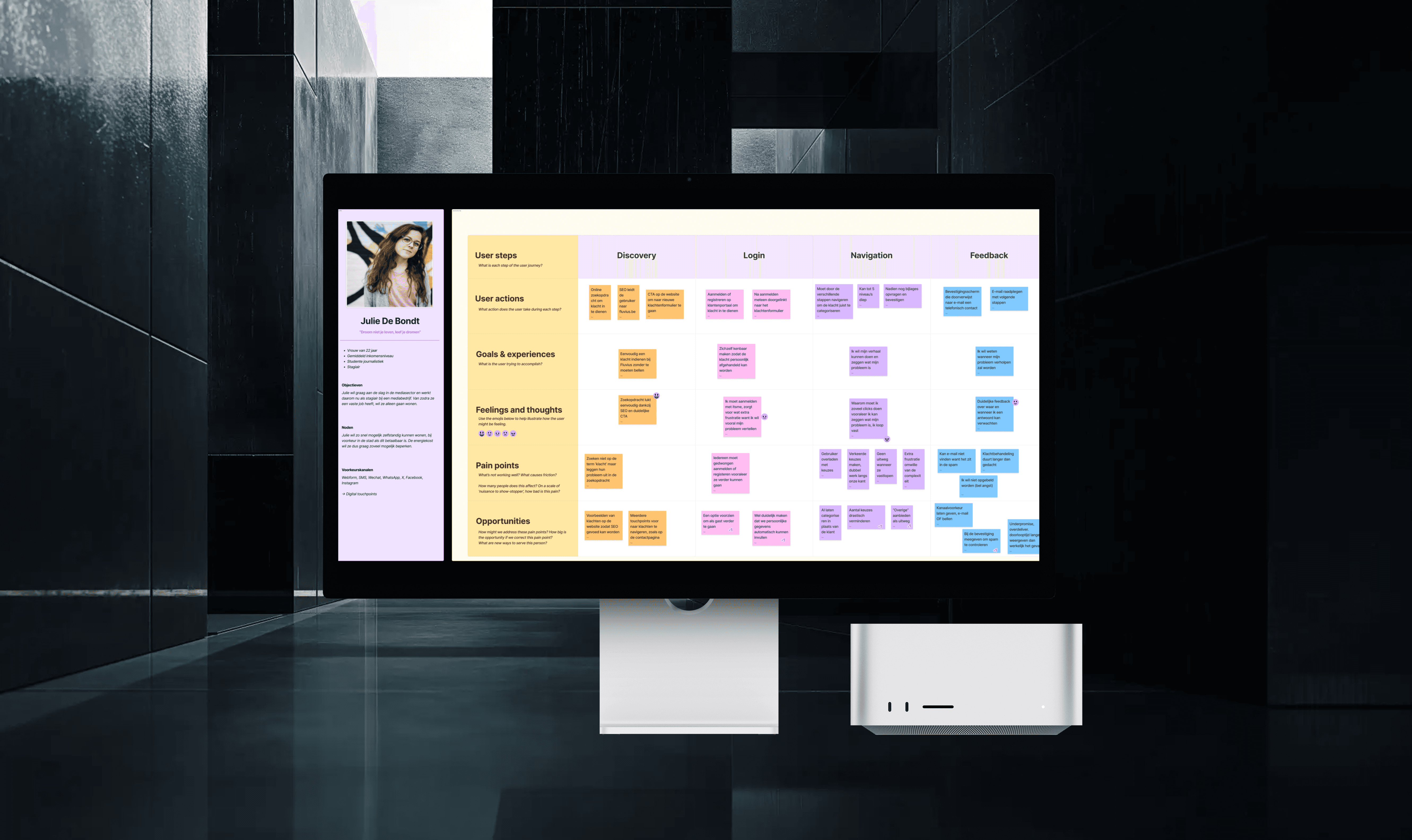
To ensure the complaint tool genuinely met users’ needs, we started by creating a detailed user journey. This helped us pinpoint the most critical pain points—moments where users typically felt frustrated, confused, or dropped out of the process. These insights directly informed how we structured our flow, ensuring every step served a purpose and supported the user.
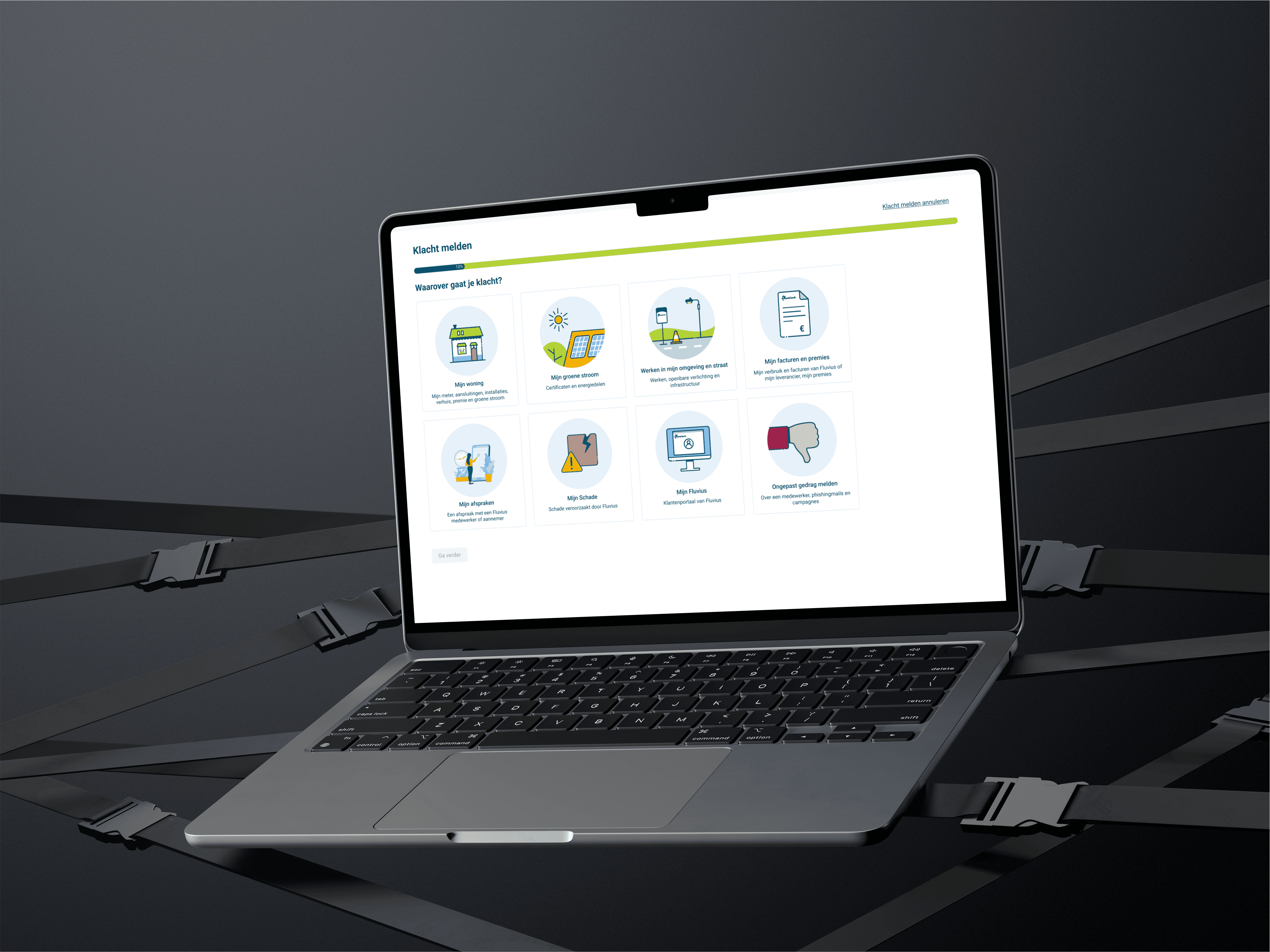
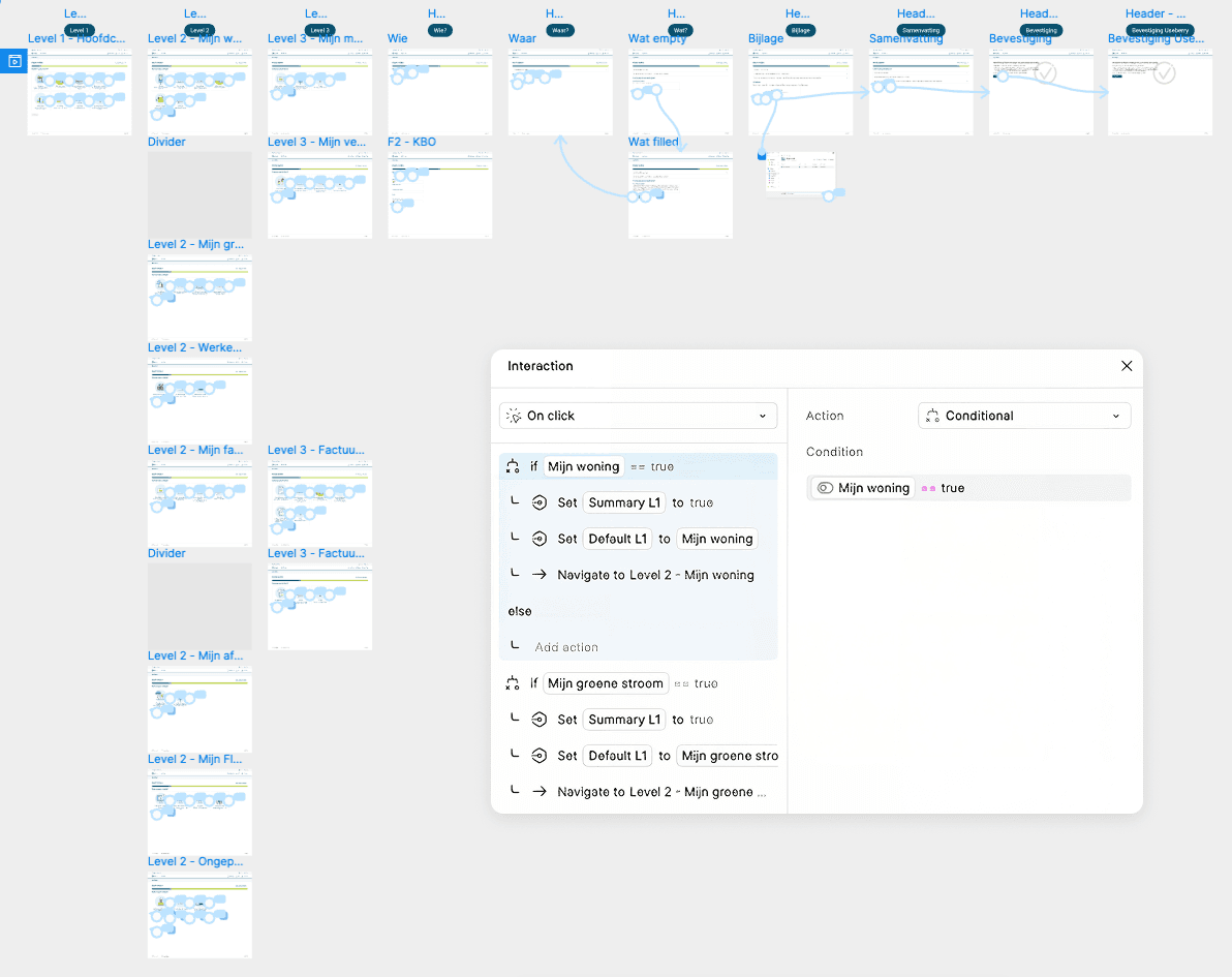
From that foundation, we designed a high-fidelity prototype in Figma using conditional logic. This allowed us to create a dynamic, decision-based experience—where users only saw relevant questions or sections depending on their previous input. For example, if a user selected a specific type of complaint, only the applicable fields and paths were shown. This made the experience feel much more tailored and efficient, while also ensuring the complaint was accurately routed to the correct business unit.
Conditional prototyping in Figma means connecting frames based on logic rather than just linear progression. Instead of a simple “click here, go to next screen” setup, we used variables and interactions to simulate real-world behavior—like dropdown selections triggering different outcomes or skipping unnecessary steps. This method not only kept the prototype close to the final user experience, but also made it easier to maintain and adapt later on.
This approach proved especially powerful when we started testing: both in-person during user interviews and remotely using Useberry, a user testing platform that allowed us to collect behavioral data and heatmaps. Because our prototype already responded to different user inputs, testers were able to interact with it in a way that felt real—and we were able to observe how their behavior aligned with our design assumptions.
Mapping the Journey to Design Smarter Flows
To ensure the complaint tool genuinely met users’ needs, we started by creating a detailed user journey. This helped us pinpoint the most critical pain points—moments where users typically felt frustrated, confused, or dropped out of the process. These insights directly informed how we structured our flow, ensuring every step served a purpose and supported the user.
From that foundation, we designed a high-fidelity prototype in Figma using conditional logic. This allowed us to create a dynamic, decision-based experience—where users only saw relevant questions or sections depending on their previous input. For example, if a user selected a specific type of complaint, only the applicable fields and paths were shown. This made the experience feel much more tailored and efficient, while also ensuring the complaint was accurately routed to the correct business unit.
Conditional prototyping in Figma means connecting frames based on logic rather than just linear progression. Instead of a simple “click here, go to next screen” setup, we used variables and interactions to simulate real-world behavior—like dropdown selections triggering different outcomes or skipping unnecessary steps. This method not only kept the prototype close to the final user experience, but also made it easier to maintain and adapt later on.
This approach proved especially powerful when we started testing: both in-person during user interviews and remotely using Useberry, a user testing platform that allowed us to collect behavioral data and heatmaps. Because our prototype already responded to different user inputs, testers were able to interact with it in a way that felt real—and we were able to observe how their behavior aligned with our design assumptions.
Validating with Real Users, Iterating with Purpose
To ensure our solution truly worked for users, we combined in-person user interviews with online testing through Useberry. This hybrid approach allowed us to gather both qualitative insights and quantitative feedback across multiple iterations.
During in-person interviews, we observed how users navigated the prototype, noted where they hesitated or got confused, and asked follow-up questions to better understand their expectations and mental models. These conversations gave us valuable context and often revealed subtle friction points that weren’t visible in analytics alone.
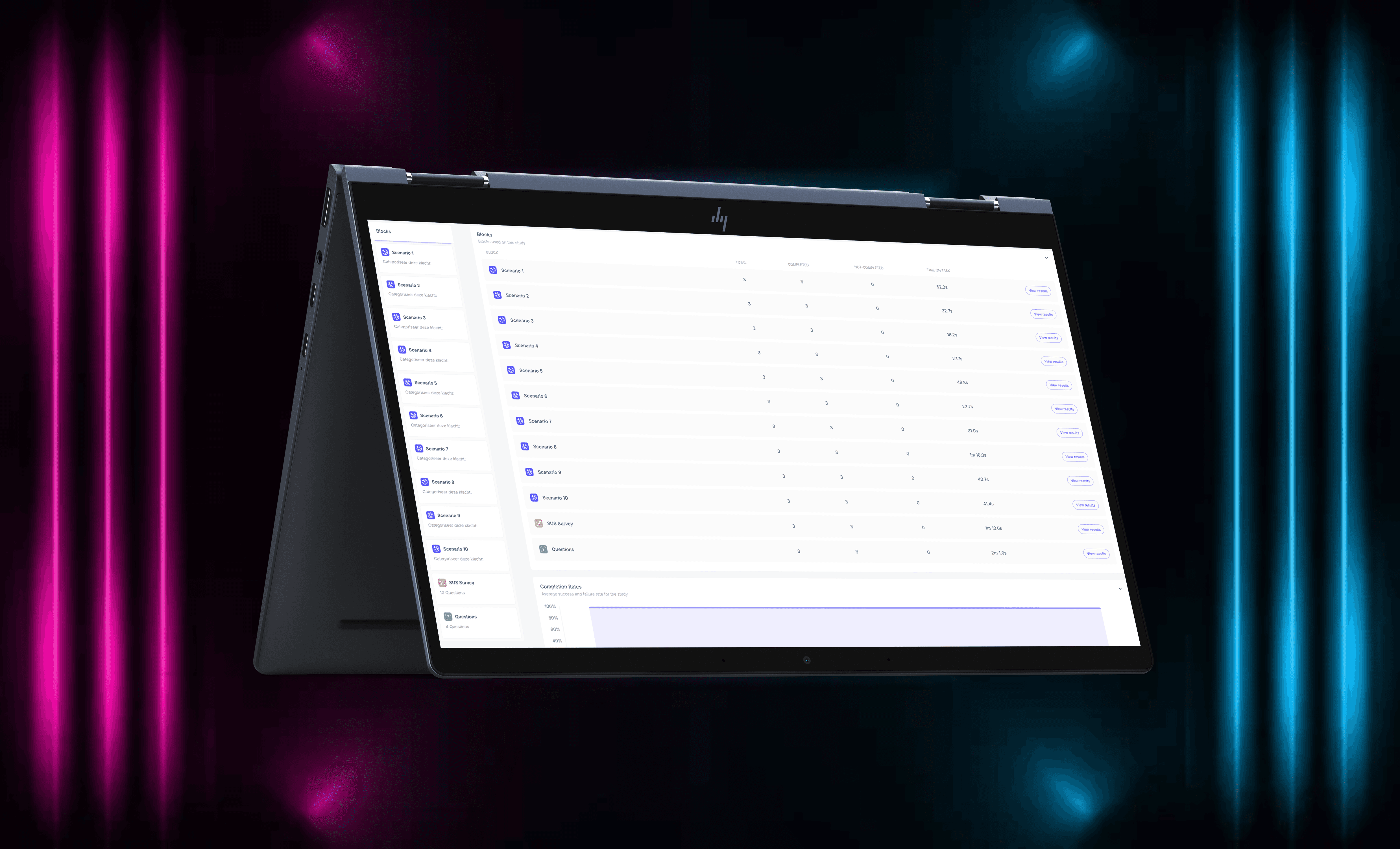
At the same time, we ran remote tests through Useberry, which allowed us to collect large-scale data across various user segments. We tracked task success rates, drop-off points, and interaction patterns—and used System Usability Scale (SUS) scoring to benchmark each version of the tool.
With each iteration, we implemented refinements based on real feedback, and it paid off:
Our final SUS score reached 82, well above the industry acceptance threshold of 68—indicating that users found the tool highly usable and intuitive.
Validating with Real Users, Iterating with Purpose
To ensure our solution truly worked for users, we combined in-person user interviews with online testing through Useberry. This hybrid approach allowed us to gather both qualitative insights and quantitative feedback across multiple iterations.
During in-person interviews, we observed how users navigated the prototype, noted where they hesitated or got confused, and asked follow-up questions to better understand their expectations and mental models. These conversations gave us valuable context and often revealed subtle friction points that weren’t visible in analytics alone.
At the same time, we ran remote tests through Useberry, which allowed us to collect large-scale data across various user segments. We tracked task success rates, drop-off points, and interaction patterns—and used System Usability Scale (SUS) scoring to benchmark each version of the tool.
With each iteration, we implemented refinements based on real feedback, and it paid off:
Our final SUS score reached 82, well above the industry acceptance threshold of 68—indicating that users found the tool highly usable and intuitive.