Project details
Client:
Fluvius
Tool:
Figma
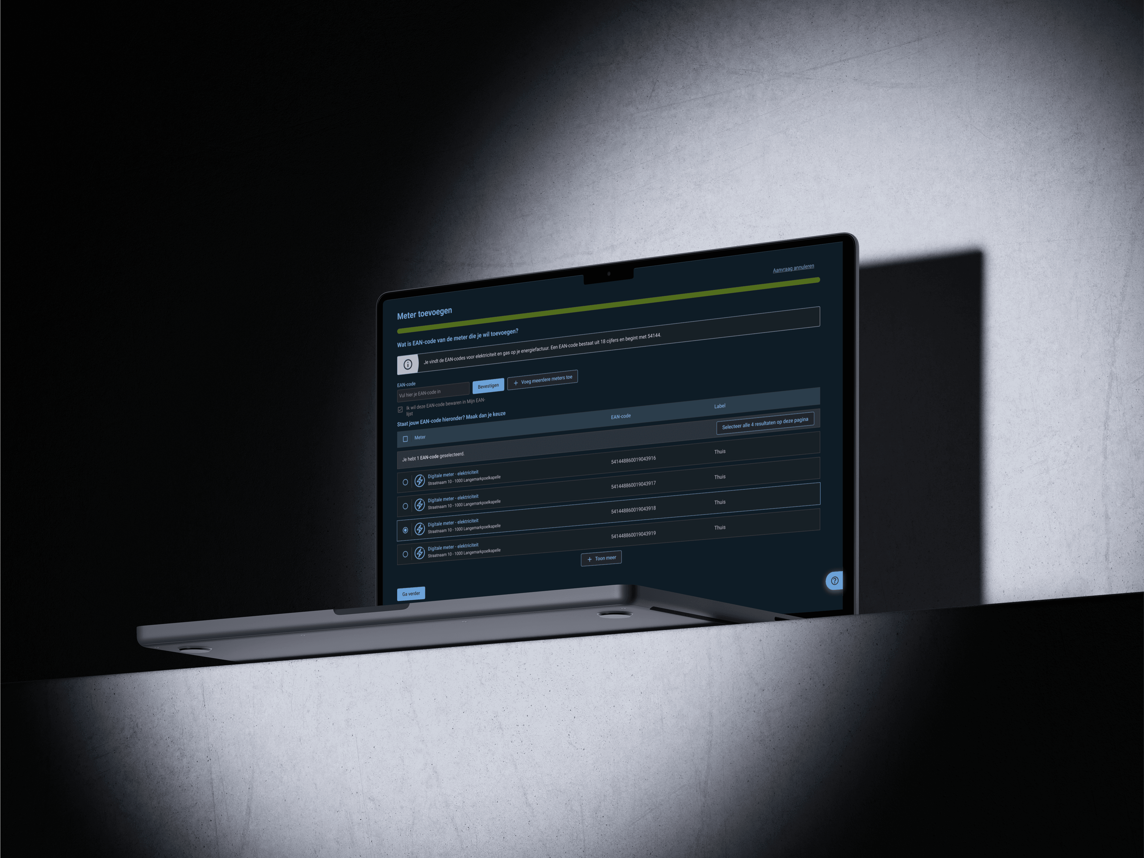
Developing Darkmode To Improve Accessibility
Why Dark Mode Improves Accessibility
Dark mode isn’t just a visual preference — it’s an important accessibility feature. For many users, especially those with visual impairments, light sensitivity, or certain cognitive conditions, dark interfaces can reduce eye strain, improve readability, and support longer screen engagement. By offering a dark mode option that meets WCAG accessibility standards, we empower users to choose the experience that best suits their needs and environments. In this case study, I explore how I adapted a light-mode design system to a fully accessible dark mode — focusing on contrast, readability, and user comfort across different use cases
Implementing Dark Mode with Semantic Tokens
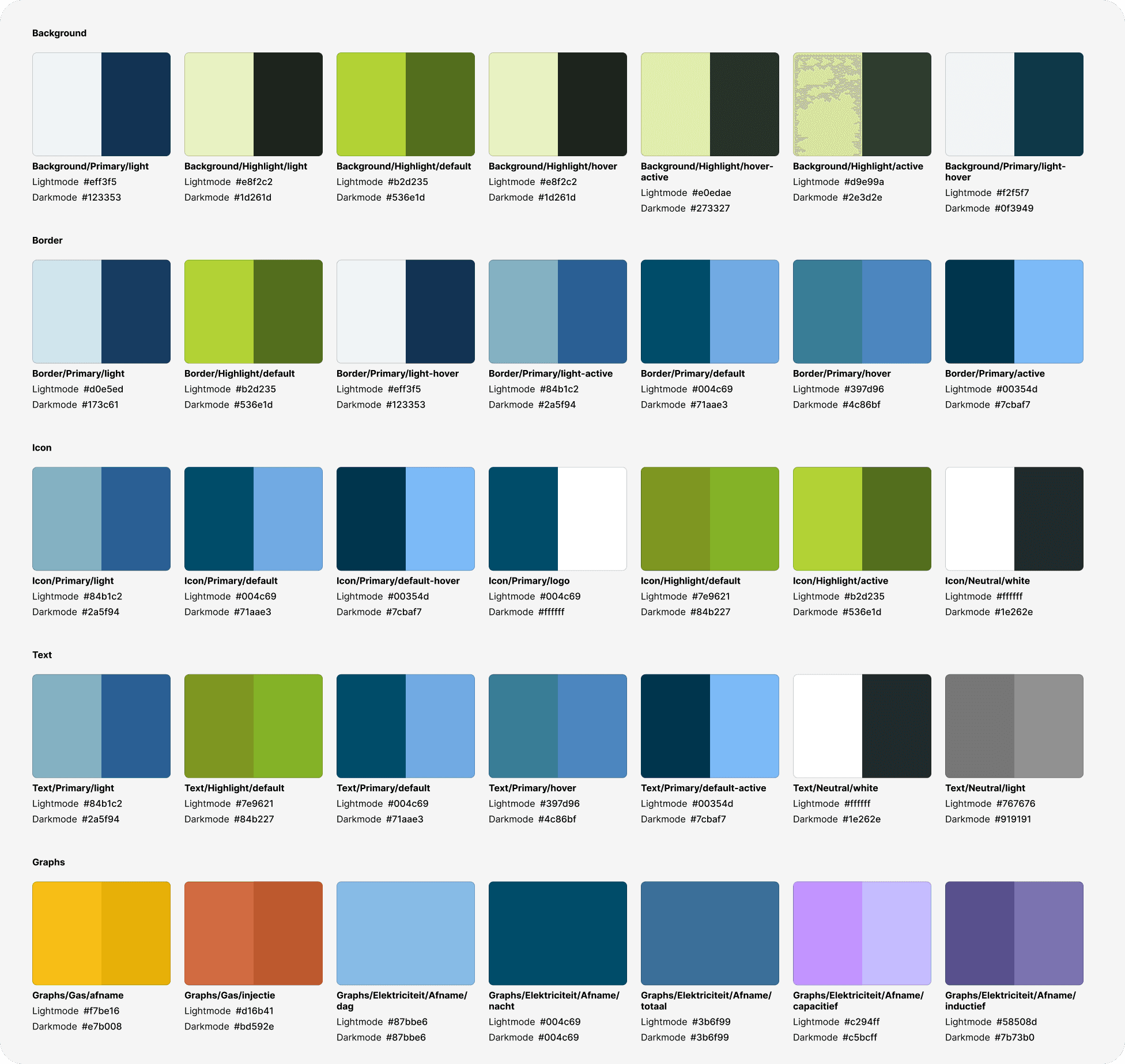
To build an accessible and maintainable dark mode, I relied on a semantic token system. Instead of hard-coding colors throughout the UI, I mapped design decisions to abstract tokens like background-default, text-primary, or border-light. These tokens represent the purpose of a color, not its appearance.
This approach allowed me to create two parallel themes — one for light mode and one for dark mode — by simply redefining the values of the same semantic tokens. For example, background-default uses a light grey in light mode and a near-black in dark mode, while still preserving appropriate contrast ratios in both.
By using semantic tokens:
I ensured WCAG AA-compliant contrast across modes
Made the system scalable and easier to maintain for developers
Allowed for future flexibility, such as high-contrast or custom themes
Encouraged a design-consistent experience across platforms
This method not only streamlined the implementation but also aligned the design system with accessibility best practices and modern development workflows
Implementing Dark Mode with Semantic Tokens
To build an accessible and maintainable dark mode, I relied on a semantic token system. Instead of hard-coding colors throughout the UI, I mapped design decisions to abstract tokens like background-default, text-primary, or border-light. These tokens represent the purpose of a color, not its appearance.
This approach allowed me to create two parallel themes — one for light mode and one for dark mode — by simply redefining the values of the same semantic tokens. For example, background-default uses a light grey in light mode and a near-black in dark mode, while still preserving appropriate contrast ratios in both.
By using semantic tokens:
I ensured WCAG AA-compliant contrast across modes
Made the system scalable and easier to maintain for developers
Allowed for future flexibility, such as high-contrast or custom themes
Encouraged a design-consistent experience across platforms
This method not only streamlined the implementation but also aligned the design system with accessibility best practices and modern development workflows
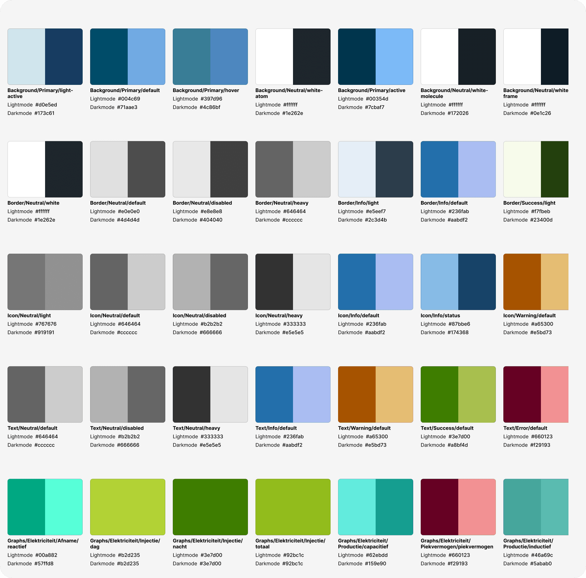
Ensuring WCAG AA Compliance for Maximum Accessibility
Accessibility was a core priority throughout the design of the dark mode theme. Every color combination — from text and icons to backgrounds, buttons, and borders — was carefully evaluated to meet at least WCAG 2.1 AA contrast standards. This means a minimum contrast ratio of:
4.5:1 for all text and icon values
Only disabled states are allowed to fail on the contrast ratio
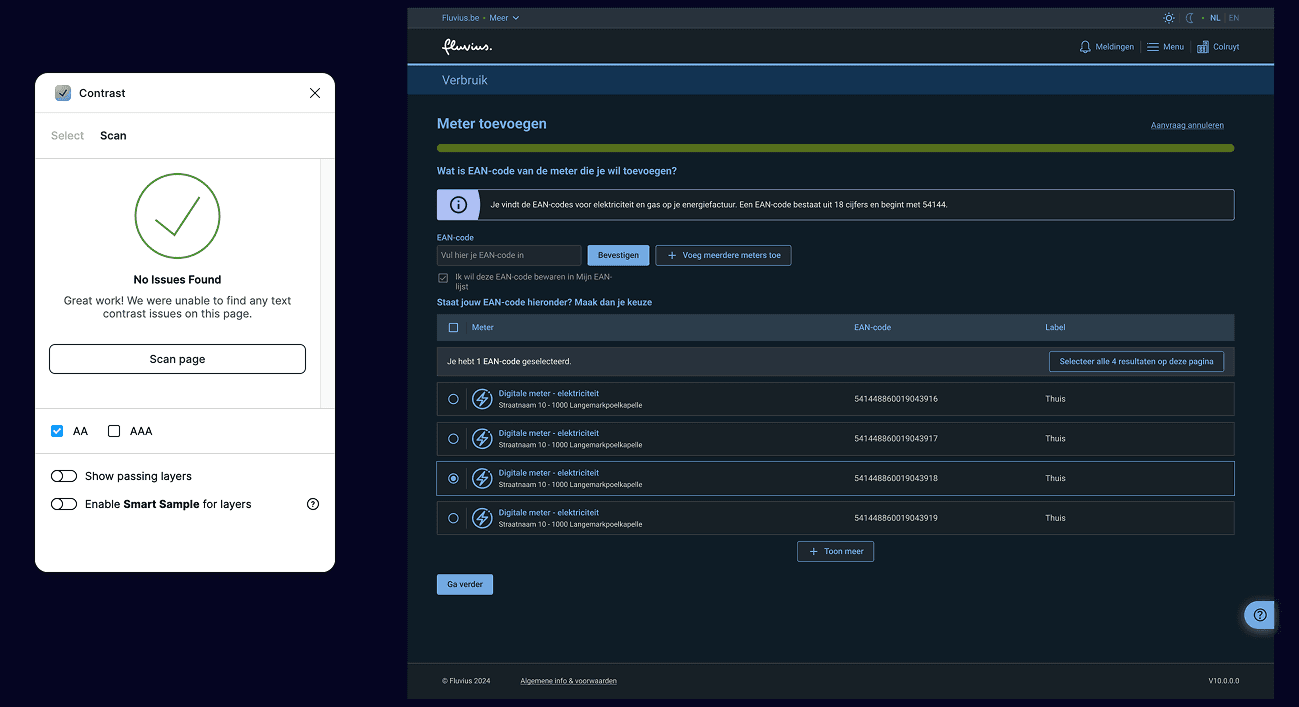
I audited each semantic color pairing across both light and dark themes to guarantee readability and usability for users with low vision or contrast sensitivity. This included edge cases like disabled states, hover/focus indicators, and subtle UI elements often overlooked in dark environments.
To maintain consistency and accessibility:
I used automated tools and manual checks to verify contrast across all components.
Tokens were tested in real UI contexts, not just in isolation.
Color values were adjusted with care to balance visual hierarchy, brand alignment, and user comfort.
This work is not only rooted in design best practices — it also supports legal compliance. Under the EU Accessibility Act, digital products and services offered in the European Union must meet accessibility requirements by June 2025. WCAG 2.1 is the globally recognized standard referenced by this legislation.
By ensuring full contrast compliance in both light and dark modes, I help make the product:
Legally compliant across EU markets
Inclusive and usable for a wider range of users, including those with visual impairments
Future-proof as accessibility standards become more strictly enforced
Designing with accessibility in mind is not only ethical — it’s essential for meeting the needs of a diverse user base and staying aligned with evolving regulations
Ensuring WCAG AA Compliance for Maximum Accessibility
Accessibility was a core priority throughout the design of the dark mode theme. Every color combination — from text and icons to backgrounds, buttons, and borders — was carefully evaluated to meet at least WCAG 2.1 AA contrast standards. This means a minimum contrast ratio of:
4.5:1 for all text and icon values
Only disabled states are allowed to fail on the contrast ratio
I audited each semantic color pairing across both light and dark themes to guarantee readability and usability for users with low vision or contrast sensitivity. This included edge cases like disabled states, hover/focus indicators, and subtle UI elements often overlooked in dark environments.
To maintain consistency and accessibility:
I used automated tools and manual checks to verify contrast across all components.
Tokens were tested in real UI contexts, not just in isolation.
Color values were adjusted with care to balance visual hierarchy, brand alignment, and user comfort.
This work is not only rooted in design best practices — it also supports legal compliance. Under the EU Accessibility Act, digital products and services offered in the European Union must meet accessibility requirements by June 2025. WCAG 2.1 is the globally recognized standard referenced by this legislation.
By ensuring full contrast compliance in both light and dark modes, I help make the product:
Legally compliant across EU markets
Inclusive and usable for a wider range of users, including those with visual impairments
Future-proof as accessibility standards become more strictly enforced
Designing with accessibility in mind is not only ethical — it’s essential for meeting the needs of a diverse user base and staying aligned with evolving regulations